1

raise up the love


Here's a sneak peek of our upcoming blog post...
0

i love september!

Just a quick note (seems like that's all my posts are these days) for some exciting news!

WE ARE OPENING SEPTEMBER BACK UP! :) We've expanded our resources and have more openings. Woo hoo!

Feel free to contact us September brides!
0

ultimate love this easter


Happy Easter all! Let's celebrate ultimate love today.

(image credit: one love photography)
1

for the love of color

Back in college days I took a class on color. Yes, the whole class was devoted to learning about color. The most interesting things I learned about colors was the effect they have on eachother, on people, on surroundings. Color is alive, it changes when it's next to another color, and it can even move & vibrate next to another color. I suppose it's all optical illusions, but it's very fascinating.

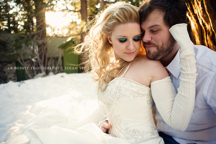
Another aspect of color is it's ability to evoke moods & feelings. Brand strategists are well aware of this fact. And I'm sure as any Bride is aware colors can completely transform the look of your day.

Colors can mean different things in different cultures, at different times, in different industries. However, in the United States advertising at least, studies suggest some universal meanings:

Blue:
Cool blue is perceived as trustworthy, dependable, fiscally responsible, and secure. Strongly associated with the sky and sea, blue is dependable and serene, and universally well-liked. Blue is an especially popular color with financial institutions, as its message of stability inspires trust.

Red: Red activates your pituitary gland, increasing your heart rate and causing you to breathe more rapidly. This visceral response makes red aggressive, energetic, provocative, and attention-grabbing. Count on red to evoke a passionate response, albeit not always a favorable one. For example, red can represent danger or indebtedness (in business).

Green: In general, green connotes health, freshness, and serenity. However, green�s meaning varies with its many shades. Deeper values are associated with wealth or prestige, while light greens are calming.

Yellow: In every society, yellow is associated with the sun. Thus, it communicates optimism, positivism, light and warmth. Certain shades seem to motivate and stimulate creative thought and energy. The eye sees bright yellows before any other color, making it great for point-of-purchase displays.

Purple: Purple is a color favored by creative types. With its blend of passionate red and tranquil blue, it evokes mystery, sophistication, spirituality, and royalty (especially in European markets). Lavender evokes nostalgia and sentimentality.

Pink: Pink's message varies by intensity. Hot pinks convey energy, youthfulness, fun and excitement and are recommended for less expensive or trendy products for women or girls (like dolls). Dusty pinks appear sentimental. Lighter pinks are more romantic.

Orange: Cheerful orange evokes exuberance, fun, and vitality. With the drama of red plus the cheer of yellow, orange is viewed as gregarious and often childlike. Research indicates that its lighter shades appeals to an upscale market. Peach tones work well with healthcare, restaurants, and beauty salons.

Brown: This earthy color conveys simplicity, durability and stability. It can also elicit a negative response from consumers who relate to it as dirty. Certain shades of brown (e.g., terracotta) can convey an upscale look. From a functional perspective, brown tends to hide dirt, making it a logical choice for some trucking and industrial companies.

Black: Black is serious, bold, powerful and classic. It creates drama and connotes sophistication. Black works well for expensive products, but can also make a product look heavy.

White: White connotes simplicity, cleanliness, and purity. The human eye views white as a brilliant color, so it immediately catches the eye in signage. White is often used with infant and health-related products.

All the colors above can be categorized into two basic categories, "warm" and "cold." In general, warm colors, like red and yellow, send an outgoing, energetic message, while cool colors like blue are calmer and more reserved. However, brightening a cool color increases its vibrancy and reduces its reserve.
0

love is bittersweet

Good afternoon everyone, and Happy Thursday!

There are still lots of posts to come, they've gotten pushed back a ton because we are now in our busiest season EVER for LAFI.

Which brings us to our next bittersweet announcement. We are now completely booked for September weddings! We are still booking for October 2009 weddings, but not for much longer! If you're interested in getting custom designs for your wedding, contact us soon! Don't wait. We'd not love to not work with you! :)

That's it for now. More invites and inspiration is on its way!
0

the love never ends...

... but unfortunately sales do! :)

Today March 31st is the final day of our Spring Appreciation Sale. If you wanted to book with us but have not had the chance, email us today and let us know! We will be extending the sale only for those who express interest before the end of the day today.

Goodbye March! You were lots of fun! Here's to April!
0

love en pointe


My husband and I took some lovely Trash the Dress pictures earlier this year, and our photographer posted them on her blog here. We just love them! Thanks again Susan for being such an amazing person and photographer!
0

i'm in love with a picture

0

august is filled with love!

Hey everybody out there in wedding land! I just heard from our production manager that August 2009 weddings are completely booked for custom wedding invitations. There may be some openings for Ready to Love in the future for August brides, but for now we are not taking anymore orders. Thanks to all the August brides and we can't wait to work with you! <3 <3

We are still taking orders from September and beyond. The earlier the better, because we've been booking fast. Also a little reminder that the Spring Appreciation sale is through March 31st, so if you have a proposal out or are thinking of working with us, contact us right away.
0

love the seventeenth of march


Apparently that is how you say Happy Saint Patrick's day in Irish! Hope everyone has a fun and safe holiday.


0

bring on the love

As a graphic designer first, and stationery design second, I realize that while the two design worlds are very different, they are of course intrinsically related to each other. There are definite styles to the wedding design world, and I find interesting when the design "real world" seemingly takes cues from the wedding/romantic/feminine style of the wedding world. But then I think, is that the chicken vs. the egg syndrome? Does wedding style/design come from real world? Or does the wedding world have it's own trends that radiate outward? It is a big enough chunk of the industry to make an impact. Either way, they do influence each other, and I'm more than happy when I identify styles from wedding design in real world packaging and vice versa. Here are some of my favorite packaging designs that include beautiful details that could be amazing wedding invitations:


0

Photo Love!


Yippee yay! We finally got a rockin' camera to take some Bee yoo teee full invitation shots with. So be on the lookout for more invite sets on Love Invites! Here's a sneeky peeky!


0

Spring Love Appreciation Sale


Spring your clocks forward and take advantage of our Spring Love Appreciation Sale!

If you book before March 31st, you will receive $50 off custom invitations and $25 off the Ready to Love collection. This offer is subject to scheduling availability, so contact us soon to reserve your spot.

The promo code is LAFILOVE, and you can let your friends in on the savings as well!

Let's create something beautiful together!
0

Ready to Love - The Favorites


It's been a very busy season for Love at First Invite, with no signs of slowing down anytime soon! :) I haven't had a chance to post much because of it, but soon we'll be showing some really exciting new works! In the meantime, here's a few images of our most sought-after Ready to Love designs in living color.
Ready to Love invitations are ready to be customized with your wording and your colors, to match your day!


0

FREE Letterpress Love!

Style Me Pretty is the host of our FREE Letterpress Invitation giveaway! The contest is for 100 Letterpressed invitations of your choice from the Spring 2009 Ready to Love collection. Head on over to the Little Black Book Blog to enter the contest. Contest ends Monday night! :)
1

Spring Love


Spring is in the air! At least for wedding invitations, it is :)

I'm so excited about this couple, they were so fun to meet with. They had a solid idea in their heads, they even brought me a sample invitation they loved! It was a single daisy on white paper with black text. I'm happy that they let me explore the idea and push a little further to give it a much brighter, warmer and happier feeling! And I normally don't post reply cards but I'm just in love with this one! They are so cute that their guests are not going to want to send them in! :)


Congratulations Wendy and Chris!!
0

New Year, New Love


I am soooo excited to let everyone in on a few exciting updates and changes for LAFI in 2009. Due to overwhelming demand, Love at First Invite will be introducing the Ready to Love collection.

This will be a few designs with different styles, that will be perfect for the Bride on a budget, the last-minute Bride or the Bride who just wants to see what she's getting! This will be launching early January, so get Ready to Love! :)
0

Love in Texas!


You know what they say about Texas. Can you imagine how stunning this wedding will be? Amanda and Kenneth are getting married in the beautiful Rockefeller Hall in Houston, Texas. Amanda is using bright apple green for her centerpieces with rich chocolate brown accents throughout. Amanda is a vintage kind of gal, while her fiancé tends to be drawn to the modern. We married those two styles and came up with this little gem :)


0

Modern Spanish Love Pt II


Goodness, It's been a busy holiday season, and subsequently it's been awhile since I blogged... I have tons of new projects to show you, but for now I would like to show you how Jennifer & Jayson's amazing invitation suite came out. These are one of my favorites so far!

We got a new printer and it's a special printing process that uses solid inks. They start off as waxy blocks, melted down, mixed and applied to paper. The end result gives a tiny bit of a raised ink feeling as you can feel the wax on the paper. Too cool! She also upgraded to 110 lb. paper which gave these invites a substantial feel.

Congratulations again to J&J :)

0

True Love


You may remember my post from awhile back about Lindsay & Brandon's beautiful Gocco'd programs. Their wedding was amazing and the colors all came together beautifully. LAFI had the pleasure of designing all the ceremony and reception items for the day. :)


Congratulations Mr & Mrs G and thank you from the bottom of my heart for letting me be a part of your unforgettable day.